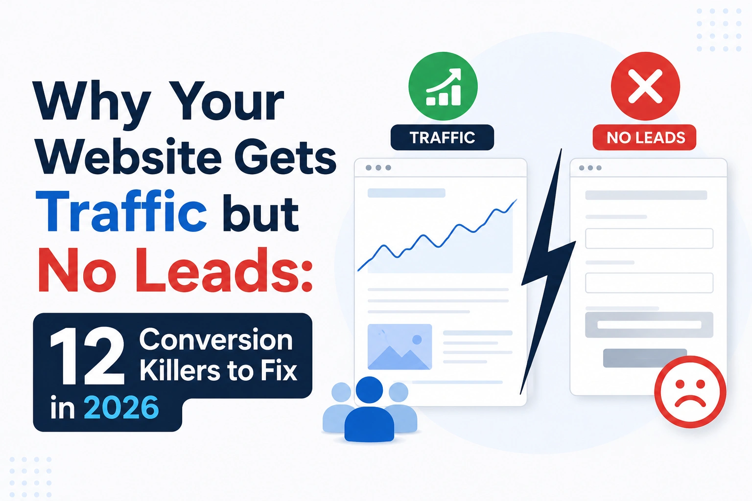
Visitors form an opinion about your website in 0.05 seconds. That is faster than a single heartbeat.
Web design influences 94% of those first impressions. 75% of people judge a company’s credibility based entirely on its website. Before they have read a headline or seen a price, they have already decided whether this business looks trustworthy.
The stakes have always been high. In 2026, they are higher. Users expect websites to load instantly, work perfectly on any phone, and give them what they need without confusion. When a website fails on any of these, the cost is not just a poor experience. It is a lost customer and often a customer who never comes back.
According to a report by Site Builder Report, 79% of users dissatisfied with a website’s performance are less likely to buy from that company again. Poor design pushes away 38% of visitors outright. And these are not edge cases. You can predict them and prevent the consequences of website development mistakes that most businesses make because they build too fast, plan too little, and treat performance and SEO as problems to solve after launch.
The ten mistakes in this guide are the ones that appear most consistently, across industries and budgets. Most of them are not expensive to avoid. They are expensive to fix after the fact.
Mistake 1: Skipping Proper Planning Before Development
Why website planning is so important?
A website built without a clear brief is almost always rebuilt within three years. Not because the technology failed. Because the website was built to the wrong specification.
Skipping proper planning does not mean cutting a few planning meetings. It means the development team starts work before anyone has agreed on what success looks like, who the website is serving, or what it should make visitors do. The result looks finished at launch. The problems only appear when the business tries to use it: there is no obvious place to add a landing page for a new campaign, the contact form does not track to anything, the site structure does not reflect how customers think about the business’s services.
The website gets rebuilt. The total cost is typically higher than doing it right the first time.
What does poor website planning look like?
In India, a common pattern among businesses building their first professional website is to describe requirements in aesthetic terms: “something clean and modern, showcasing our services, professional-looking.” A local developer or agency takes the brief, delivers exactly that, and the client receives a website that looks right but has no conversion goals, no SEO foundation, no defined content hierarchy, and no maintenance plan.
A related failure: development begins before the final content exists. Pages get built around placeholder text, then real copy is forced into layouts that were not designed for it. The result is visual inconsistency, awkward formatting, and a site that looks like it was designed by committee.
How do you avoid this?
Write a requirements document before any design or development work begins. It does not need to be long. It needs to answer:
- What specific actions should this website drive? (Form enquiries, product purchases, phone calls; not “represent our brand”)
- Identify the different visitor types and what each of them need to find?
- Identify any integrations required? (CRM, payment systems, booking systems)
- What content will the site have and who will be responsible for its creation and ongoing maintenance?
- What would success look like 12 months after launch?
Agree this document with every stakeholder before the agency or developer starts work. Scope changes after development begins are the most common reason website projects run over budget.
The website development process starts here, with clarity. Everything that follows is execution.
Mistake 2: Choosing the Wrong Technology Stack
Why does the technology choice matter?
The technology stack is the foundation everything else is built on. Choose the wrong one and you will feel it for the lifetime of the website: slow performance, expensive maintenance, features that cannot be added without a rewrite, and developers who cannot work on the code without weeks of onboarding.
The most common tech stack mistake is not choosing an obscure or experimental technology. It is choosing a familiar one by default, without assessing whether it fits the project.
What goes wrong when the stack is wrong?
WordPress is the most common example. It is an excellent choice for many websites: blogs, content-heavy sites, small business brochure sites with standard functionality. It becomes the wrong choice when it is selected automatically for an e-commerce platform handling thousands of SKUs, a high-traffic web application requiring complex user interactions, or a marketing site that would load three times faster and require half the maintenance as a static site.
Agencies often recommend what they are comfortable building in. Clients often choose what their competitors are using. Neither of these is the right reason to choose a technology. The project’s requirements like, complexity, traffic expectations, content management needs, integration requirements, and the client’s technical capability for ongoing management — should drive the choice.
How do you choose the right stack?
Ask these questions before any technology is selected:
- * What volume of traffic is the site expected to manage and what does that peak level look like in 3 years time?
- Who will manage the content once the site is live, and what level of technical skill can we expect from them?
- What integrations are required? Do these work well with this technology?
- How actively maintained is this technology, and will developers still be available for it in five years?
- What is the security maintenance burden — how frequently do updates need to be applied, and what happens when they are missed?
A simple marketing site often needs the simplest possible stack: fast, secure, maintainable by non-developers. A complex platform needs something built for scale. The right answer is different for every project and should be determined by the brief, not the agency’s default.
Mistake 3: Ignoring Website Speed and Performance
Why does speed affect conversions so directly?
The probability of a visitor bouncing increases by 32% as page load time increases from 1 to 3 seconds. A mobile site that loads in one second converts three times better than one that takes five seconds. A one-second delay in load time can cut conversions by up to 20%.
These numbers describe a relationship that has nothing to do with the quality of your product or the strength of your offer. Before a visitor can read a headline or see a price, they have already decided whether to wait. Most will not.
The benchmark is specific and revealing: Google’s first-page results load in an average of 1.65 seconds. The average web page loads in 3.21 seconds. Nearly 46% of websites still take six to ten seconds. The businesses ranking well are loading twice as fast as the majority of websites. That is not coincidence.
What causes websites to be slow?
The most common causes, in roughly declining order of impact:
- Unoptimised images. The single largest contributor to page weight on most websites. A raw photograph uploaded without compression can be 5-10MB. The same image optimised and served in WEBP or AVIF format can be under 200KB. WEBP and AVIF formats load 15-21% faster than JPEG.
- Third-party scripts. Every tool added to a website analytics, chat widgets, social media pixels, marketing automation tags adds a script that must load before the page is complete. A typical marketing website in 2026 carries 20 to 30 third-party scripts, many of which have not been reviewed since they were added.
- Bloated WordPress installations. Websites built on WordPress with numerous plugins, a page builder, and a heavy theme can carry significant loading overhead that accumulates invisibly over time as updates and additions are made.
- Inadequate hosting. A website on a cheap shared hosting plan shares server resources with hundreds of other sites. During high-traffic periods, performance throttles regardless of how well the site code is written.
For Indian businesses, there is an additional factor that global benchmarks do not capture. India has significant internet usage on 2G and 3G connections, particularly outside major metros. A website optimised to load in under two seconds on 4G in Mumbai may load in seven or eight seconds for a potential customer in a Tier 2 or Tier 3 city on a slower connection. Explicit performance budgets for lower-bandwidth environments are part of responsible website development for the Indian market.
How do you fix slow websites?
Start with Google Search Console’s Core Web Vitals report. This gives you specific pages and specific metrics with failing scores. Address them in order of traffic impact. Compress and convert all images to WEBP. Audit and remove unnecessary third-party scripts. Minimise and defer render-blocking JavaScript. If hosting is inadequate, upgrade before optimising code. A CDN is worthwhile for any site with national or international traffic.
Mistake 4: Forgetting About Mobile Users
Why is mobile experience non-negotiable?
Mobile now accounts for roughly 64% of global web traffic. In India, that proportion is higher, and still growing. A website that does not work well on mobile is failing the majority of its visitors before they have had a chance to engage with the content.
The consequences are measurable. Mobile bounce rates run approximately 12 percentage points higher than desktop for non-optimised sites. Mobile converts approximately 42% lower than desktop when sites are not built mobile-first. And since Google’s mobile-first indexing reads your mobile site as the primary version for search ranking, a poor mobile experience directly damages visibility before a single visitor arrives.
What does poor mobile experience look like?
The problem is rarely that a website is unresponsive. Most websites built in the last five years use responsive frameworks that technically adapt to smaller screens. The problem is that responsive does not equal usable.
Common mobile experience failures that are invisible on a desktop browser:
- Tap target size. Buttons and links designed for mouse clicks are often too small for a thumb. Tapping the wrong link, or missing it entirely, is a mobile UX failure that desktop testing never reveals.
- Form field keyboards. An email field that opens a standard keyboard instead of the email keyboard. A phone number field that opens QWERTY instead of a number pad. These small failures create significant friction on forms that work perfectly on desktop.
- Content that technically fits but doesn’t read. Text that is set at a size appropriate for desktop looks microscopic at 375 pixels. Column layouts that make sense at 1440px can produce navigation that requires five taps to find what a desktop user sees immediately.
- Critical actions placed below the fold on mobile. CTAs that appear in the upper third of a desktop page can sit far below the initial viewport on a phone, never seen by users who don’t scroll.
How Do You Build Websites for Mobile Properly?
Design for the smallest target screen first. The discipline of fitting a UI into 375 pixels forces clarity in navigation and hierarchy that desktop design allows you to avoid.
Test on actual devices, not browser emulators. Have someone outside the development team complete the website’s primary conversion goal on a physical phone with no guidance. Watch where they hesitate. Watch what they miss.
Prioritise speed specifically for mobile. The performance targets for mobile are more demanding than for desktop, because the connection is slower and the user’s tolerance for waiting is lower.
Mistake 5: Treating Security as an Afterthought
Why does security get overlooked?
Security is invisible until it fails. A website with no SSL, outdated plugins, and default admin credentials looks identical to a secure one in a browser. The problem only becomes visible when a visitor sees a “Not Secure” warning, when Google flags the site as dangerous, or when the business discovers its website has been used to serve malware for three months without anyone noticing.
Most security failures are not the result of sophisticated targeted attacks. They are the result of automated bots continuously scanning the internet for sites running vulnerable versions of common software. WordPress with outdated plugins is the most common target in India’s SME market. Once compromised, a site is typically used for phishing, spam distribution, or cryptocurrency mining, and the site owner is usually the last to find out.
What are the most common website security mistakes?
- No HTTPS. An SSL certificate takes minutes to install. Google has flagged unencrypted sites as “Not Secure” since 2018. Browsers display prominent warnings. Visitors leave.
- Plugin and theme neglect. Most WordPress site compromises exploit known vulnerabilities in plugins that were updated weeks or months before the attack, but the site owner never applied the update.
- Weak admin credentials. Default usernames and easily guessed passwords. The majority of brute-force login attempts use “admin” as the username because it is the WordPress default and most installations never change it.
- No backup system. When a site is compromised or suffers data loss, recovery is only possible if there is a recent backup stored off-server. Most small business websites have no automated backup system.
How do you secure a website properly?
Implement HTTPS across the entire site from the day it launches. Set a plugin and theme update schedule weekly is appropriate for most sites. Change default admin usernames. Use strong, unique passwords on all admin accounts, and enable two-factor authentication where the CMS supports it. Set up automated daily or weekly backups stored off the hosting server. For sites handling payments or sensitive personal data, commission a professional security audit before launch.
Security is significantly cheaper to implement during website development than to remediate after a breach.
Mistake 6: Building Without SEO in Mind
Why must SEO be in the build, not retrofitted after?
A website can look perfect in a browser and be structurally invisible to Google.
This is the developer-marketer gap. Developers build what they see. Search engines read the underlying structure the URL architecture, the heading hierarchy, the schema markup, the meta tags, the crawlability of JavaScript-rendered content. When no one on the development team is responsible for these, they do not get built correctly.
Retrofitting SEO after launch means undoing work already done. URL changes require redirects that need to be maintained indefinitely. Heading hierarchy changes require touching every page. Schema implementation requires adding structured data to pages that were not built to accommodate it. Each fix is possible. Each one is more expensive and disruptive than building it correctly from the start.
What SEO mistakes happen during web development?
- No clean URL structure. URLs generated automatically by the CMS often contain query strings, ID numbers, or parameters that tell Google nothing about what the page contains.
- Missing or duplicate meta titles and descriptions. The CMS default is often the site name on every page. Duplicate titles dilute each page’s ability to rank.
- Incorrect heading hierarchy. Multiple H1 tags, H2s used for visual size rather than structural meaning, or no H1 at all. Heading hierarchy is how search engines understand content priority.
- No schema markup. Structured data is what earns featured snippets and gets cited in AI Overviews. It also tells Google about the business’s identity, location, and expertise. Most websites launch without any schema implementation.
- JavaScript-rendered content. Frameworks that render content entirely in the browser can present near-blank pages to Google’s crawler. The site looks complete in Chrome; Google sees almost nothing.
How Do You Build A SEO-ready Website?
An SEO specialist should be involved at the planning stage, not the launch stage. The requirements document should specify URL structure conventions, meta tag templates, heading hierarchy rules, and schema types needed for the business’s content before any code is written.
For content that needs to rank, structure each page around a single primary topic, with one H1 containing the target phrase, H2s for the main supporting sections, and content that leads with the direct answer to the question the page is intended to answer. This structure also makes content more likely to be cited in AI Overviews and voice search responses the same structural decisions benefit all discovery channels.
Mistake 7: Poor User Experience and Confusing Navigation
Why does UX affect conversions more than design?
Improving UX design alone can boost conversions by up to 400%. Cluttered designs see approximately 50% higher bounce rates. Simplified navigation reduces bounce by up to 40%.
These numbers reflect a consistent finding: the visual quality of a website matters far less than how easy it is to use. A beautifully designed website with confusing navigation loses visitors. A simple, clear website with obvious next steps keeps them.
The underlying cause of most UX failures is the brochure misconception. Businesses treat their website as a digital version of a company brochure designed to look impressive and communicate the brand’s range. A brochure is a passive object that gets read linearly. A website is an active system that should be doing specific work: qualifying visitors, building confidence, reducing objections, and guiding them toward a clear action.
What are the most common UX and navigation mistakes?
- No clear primary CTA on the homepage. A visitor lands on the homepage and sees five different navigation links, three service categories, a news section, and a banner. Nothing tells them what to do next.
- Navigation that mirrors the company’s org chart. Menus structured around internal teams and business units rather than how customers think about their problems. Visitors search for what they need; they do not know how the business is organised.
- Contact information buried in footers. For service businesses, a visible phone number or contact path is a conversion element. Hiding it adds friction at the moment a visitor is ready to act.
- Content designed before content is written. Many websites are built with placeholder text, then real content is crammed into layouts that were not designed for it. The result is broken formatting, truncated headlines, and a layout that clearly was not designed for what the business needs to say.
The correct sequence is: strategy → content architecture → copy → design → development. When this order is reversed, the website that comes out usually needs to be redesigned within two years.
How Do You Design Better UX?
Define one primary action for each page before designing it. Build every visual decision around making that action obvious and frictionless.
Test with real users. Ask someone outside the team to complete the website’s primary conversion goal without guidance. Observe where they hesitate, what they cannot find, and where they give up. This is more valuable than any A/B test.
Keep navigation to the decisions visitors actually make. If a visitor cannot describe where to click to get to the thing they need within three seconds, the navigation is too complex.
Mistake 8: Launching Without Thorough Testing
Why is testing always cut first?
Testing is the first thing removed from a website development project when the timeline slips. It has no visual deliverable, it does not add features, and its value is invisible until something breaks. Under time pressure, it gets compressed or skipped entirely.
The consequence is that launch day which is typically the highest-traffic moment a website will ever see is when bugs, broken forms, and performance failures first become visible. A broken contact form during a product launch. A payment gateway error during a promotional campaign. A 404 on the most important landing page the day after it is announced. The damage from these failures at launch is disproportionately large because it coincides with the highest volume of potential customers.
What types of testing does a website need?
A complete test plan covers six categories:
- Functional testing. Every form, button, link, filter, and interactive element does what it is supposed to do.
- Performance testing. The site loads within target times under expected traffic volume, not just in isolation.
- Security testing. Common vulnerability types (SQL injection, cross-site scripting, insecure authentication) are tested and addressed.
- Cross-browser and cross-device testing. The site functions correctly across Chrome, Firefox, Safari, and Edge, on desktop and on multiple mobile screen sizes.
- Accessibility testing. The site can be navigated by keyboard, passes automated WCAG compliance checks, and has been reviewed for common failures. Around 67% of websites have accessibility violations.
- User testing. Real users complete core tasks on the site without prompting, and their behaviour reveals UX failures that internal testing misses.
How Do You Build Testing Into The Website Development Process Properly?
Testing needs to be in the project plan from the start, with time and resources allocated to it. When a project runs late, testing should not be the contingency. Ship features to account for a delay before removing the quality control.
For functional and performance testing, automate what can be automated and schedule it to run continuously after launch. Production bugs discovered three days post-launch are significantly less damaging than bugs discovered three weeks later when organic traffic has accumulated.
Mistake 9: Not Planning for Growth and Scalability
Why does scalability fail in most web development projects?
Scalability problems rarely show up at launch. They show up 18 months later, when the marketing team wants to add a landing page and discovers they cannot do it without a developer, or when a product launch brings three times the usual traffic and the site grinds to a halt.
Most websites are built for the business as it exists at launch, not the business as it will be in three years. This is partly a planning failure and partly a cost-cutting decision — building for future scale costs more upfront and the returns are deferred. The result is a website that delivers a complete rebuild on a two-to-three-year cycle rather than an evolution on a continuous roadmap.
What are the signs a website was not built to scale?
- The marketing team cannot publish content, update prices, or create landing pages without a developer’s involvement
- Adding a new feature requires changes throughout the codebase rather than a modular addition
- Traffic spikes caused by a campaign or media coverage slow the site or take it offline
- The CMS cannot handle the content volume the business now produces
- Database queries that were fast at launch take seconds as data has grown
The most expensive form of poor scalability is not server capacity — that is relatively cheap to solve with upgraded hosting. It is code architecture that does not support the marketing team’s independence. When a marketing team cannot execute campaigns without a developer for every change, the velocity of the business slows down in proportion to the bottleneck.
How do you build website for growth?
Choose a CMS that the marketing team will be able to manage independently, with appropriate permissions and a content model that fits how the business actually works. Design modular, component-based front-ends where new page types can be assembled from existing components. Plan the database schema for the data volumes expected in three years, not just today’s. Use hosting infrastructure that scales with traffic rather than requiring migration when capacity is reached.
Build a content governance model at the same time as the technical architecture. Who can publish what? What templates exist for new page types? How are redirects managed when URLs change? These questions, answered at launch, prevent the accumulated entropy that makes websites impossible to maintain.
Mistake 10: Ignoring Accessibility
Why is accessibility treated as optional?
Accessibility violations are usually invisible to the people who create them. Developers build and test using the same browsing behaviour as everyone else. A site that looks and works correctly to a sighted user with a mouse may be completely unusable for someone relying on a keyboard, a screen reader, or a switch access device.
Around 67% of websites have accessibility violations. This is not because most developers are indifferent to accessibility it is because accessibility is not mentioned in most project briefs, and therefore never enters the build process.
What are the business consequences of ignoring accessibility?
The most immediate consequence is that the website excludes a portion of potential customers. Approximately 15% of the global population experiences some form of disability. Visual impairments, motor difficulties, and cognitive differences affect how people use the internet. A website that cannot be navigated by keyboard, that has insufficient colour contrast, or that has no alt text on product images is inaccessible to a share of potential customers.
A less obvious consequence: accessibility improvements also improve SEO. Alt text on images helps Google’s image indexing as much as it helps screen readers. Semantic HTML structure benefits search engine crawlers and assistive technologies equally. Logical heading hierarchy that WCAG requires is the same heading hierarchy that search engines use to understand content priority. The two disciplines share most of their foundational requirements.
Legal exposure is a growing concern for businesses serving international markets. Accessibility legislation in the UK, EU, and US carries real enforcement risk.
How do you build an accessible website?
Run your current site through a free accessibility checker — WAVE and Axe are both reliable starting points. This surfaces the most common violations: missing alt text, insufficient colour contrast ratios, form inputs without labels, links with no descriptive text.
WCAG 2.2 AA is the practical standard for most commercial websites. It is not a burden — the majority of compliance requirements are good web design practice regardless of accessibility. Add accessibility requirements to the development brief alongside performance and SEO. Build them into design reviews, code reviews, and QA testing. An accessible website is not a special version of a website. It is a well-built one.
A Quick Checklist for Correct Website Developement
Before launch, use this as a minimum baseline review. Each fail is a known problem with a known fix.
| Area | Check |
| Planning | Is there a written brief with goals, audience, and success metrics? |
| Planning | Is final content ready before design begins? |
| Technology | Was the technology stack chosen for project needs, not convention? |
| Speed | Does the site load in under three seconds on a mobile connection? |
| Speed | Are all images compressed and served in WEBP or AVIF? |
| Speed | Do Core Web Vitals pass in Google Search Console? |
| Mobile | Has the site been tested on actual iOS and Android devices? |
| Mobile | Are all tap targets comfortably sized for thumb interaction? |
| Security | Is HTTPS active across every page? |
| Security | Are all plugins, themes, and frameworks on current versions? |
| SEO | Does every page have a unique meta title and description? |
| SEO | Is there a single H1 and a logical heading hierarchy? |
| SEO | Is Organisation schema implemented at minimum? |
| UX | Is a clear primary CTA visible on the homepage without scrolling? |
| UX | Can a new visitor understand what the business does within five seconds? |
| Testing | Have all forms and interactive elements been tested end-to-end? |
| Testing | Has the site been tested across Chrome, Firefox, Safari, and Edge? |
| Accessibility | Do all images have descriptive alt text? |
| Accessibility | Does the site pass WCAG 2.2 AA colour contrast requirements? |
| Analytics | Is tracking configured with conversion goals before launch? |
Any fail in Security or Speed is a critical fix before launch. Any fail in SEO or Mobile is a high-priority fix.
Build It Right the First Time
Most website development mistakes are not caused by technical failure. They are caused by starting in the wrong order.
Speed gets ignored because it was not in the brief. SEO gets missed because the developer is not an SEO specialist and no one asked for it. Mobile UX fails because testing was done on a desktop browser. Security degrades because updates were never scheduled. The website needs a rebuild in three years because the requirements were written after the design was started.
Every mistake in this guide has the same underlying cause: treating website development as a production task with a finish line, rather than as a strategic process that starts with clarity and continues after launch.
A website is not a brochure. It is a business asset that operates continuously, competes for attention constantly, and either grows the business or quietly costs it customers every day. The businesses that treat it this way that plan before they build, that test before they launch, that measure and improve after end up with websites that compound their investment over years instead of requiring replacement every two.
At Savit, our website design and development work starts before any design begins. We work backwards from what the website needs to achieve the specific actions, the specific audience, the specific integrations, the specific performance requirements and then build the brief, the architecture, and the technology choices around those answers.
Our website development process builds SEO in at the planning stage. Schema, URL structure, heading hierarchy, and meta tag architecture are specified before a wireframe exists. Performance targets are set for the actual connections our clients’ users have, tested before launch, and monitored after. Mobile experience is designed first, tested on physical devices, and not considered complete until the full conversion path works on a thumb.
We are a digital marketing firm in India with over two decades of experience building websites across industries and markets. We know what Indian businesses need from a website, and we know the specific ways Indian market conditions, from the bandwidth reality outside major metros to the first-website learning curve of growing SMEs, affect what good website development looks like in practice.
As the best digital marketing company in India, our web development and web design work covers the full lifecycle: discovery, requirements, architecture, design, development, SEO, testing, launch, and ongoing maintenance that keeps websites compounding value rather than decaying.
Talk to Savit about website development that performs from day one.