Good web design does not make users adapt to the screen. It adapts to the way people use it.
Key Highlights
- Responsive website design allows a website to adapt its layout and content to different screen sizes.
- It uses flexible grids, images, typography and CSS media queries to create a consistent experience across devices.
- Responsive design improves usability by reducing issues such as horizontal scrolling, tiny text and difficult navigation.
- Responsive design benefits extend to website maintenance, accessibility, performance and SEO.
- Responsive design and mobile-friendly design are related, but responsive design focuses on adapting the layout itself.
- Responsive website development should include performance, accessibility and cross-device testing from the start.
- Businesses should evaluate UX, development expertise, SEO knowledge and ongoing support when choosing a web page design company.
- A well-planned responsive website can provide a stronger foundation for long-term digital growth.
What is responsive website design?
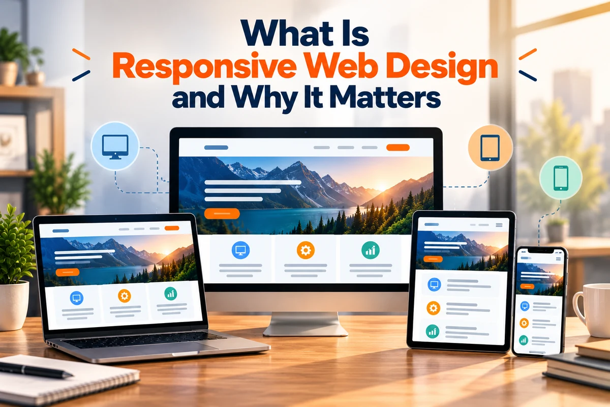
Responsive website design is an approach to building websites that allows pages to adapt to different screen sizes and resolutions.
A visitor may open the same website on a smartphone, tablet, laptop or desktop monitor. Instead of displaying a fixed layout that works well on only one screen, a responsive website changes its structure according to the available space.
For example, a desktop page may display three content columns. On a tablet, those columns may become two, while on a smartphone they may stack into a single column. Navigation, images, buttons and spacing can also change to suit the smaller screen.
According to MDN, responsive web design is intended to make web pages work well across different screen sizes and resolutions while maintaining usability. Modern responsive design uses techniques such as flexible layouts, media queries, responsive images and responsive typography.
What can adapt on a responsive website?
- Page layouts
- Navigation menus
- Images and videos
- Font sizes
- Spacing
- Buttons and forms
- Content columns
- Cards and other interface elements
The goal isn’t simply to shrink a desktop website. It is to make the entire experience usable across different screens.
How does responsive web design work?
Responsive design combines several technologies and design principles.
- Flexible layouts
CSS Grid and Flexbox allow developers to create layouts that expand, shrink or rearrange as the available space changes.
Instead of relying entirely on fixed widths, flexible layouts can use relative measurements and responsive rules.
- Media queries
CSS media queries adapt styles based on features like viewport width or orientation. For example, they can show a horizontal navigation bar on larger screens and switch to a compact menu on smaller devices.
MDN identifies media queries, responsive layout technologies and mobile-first design as important parts of responsive web development.
- Responsive images
Images need to adapt as well. A large image that works on a desktop may be unnecessarily heavy on a smartphone.
Responsive image techniques allow browsers to select an appropriate image based on factors such as viewport size and screen resolution. This can reduce unnecessary data usage and support better performance.
- Responsive typography
Text must remain readable across different screen sizes. Headings, paragraphs and other text elements may need different sizes and spacing depending on the viewport.
- Viewport settings
The viewport configuration tells mobile browsers how to interpret the page’s dimensions. Without appropriate viewport settings, responsive layouts may not behave correctly on mobile devices.
Together, these elements form the technical foundation of responsive website design.
Why does responsive web design matter?
People don’t browse the web from a single device. A website may be accessed from a phone while travelling, a laptop at work or a tablet at home.
A website that works properly on only one screen can create unnecessary barriers.
A responsive website makes it easier to:
- Read text without excessive zooming
- Navigate menus on smaller screens
- View images without horizontal scrolling
- Complete forms
- Tap buttons and links
- Find important information
- Move between devices
- Complete purchases or enquiries
The website becomes more adaptable to how users browse.
What are the main responsive design benefits?
The responsive design benefits go beyond making a website look better on mobile.
1. Better user experience
Content stays readable, and navigation stays usable across different screens.
2. Consistent brand experience
Businesses can maintain their core visual identity, messaging and functionality across devices.
3. Easier maintenance
A responsive website generally allows businesses to manage one website structure instead of maintaining separate desktop and mobile versions.
4. Better mobile usability
A responsive layout can reorganise content and controls so that users can interact with them more comfortably on smaller screens.
5. Stronger accessibility foundation
Responsive layouts support resizing and zooming; however, they don’t ensure accessibility. Accessibility needs proper contrast, keyboard navigation, labels, semantic structure, and other practices.
W3C’s accessibility guidance emphasises designing content that remains usable across different devices and user needs.
6. SEO advantages
Google has supported responsive web design as a way to create mobile-friendly websites. Using one URL and the same core content across devices can also simplify crawling and website management.
These responsive design benefits make responsive design an important part of modern website planning.
Responsive design vs mobile-friendly design: What’s the difference?
Responsive and mobile-friendly design are often confused, but they are different. A mobile-friendly website is usable on mobile devices, while responsive design uses flexible layouts and techniques to adapt to various screen sizes.
| Responsive design | Basic mobile-friendly approach |
| Layout adapts to different screen sizes | Website may simply be adjusted for mobile |
| Uses flexible grids and responsive rules | May use fixed or device-specific layouts |
| Designed for a range of viewports | May focus mainly on mobile |
| One flexible website structure | Can involve separate approaches |
| Easier to adapt to new screen sizes | May require additional adjustments |
A responsive website should therefore be thought of as a flexible system rather than a smaller version of a desktop page.
What makes a responsive website effective?
A website may technically adapt to screen size but still deliver a poor user experience. Effective responsive design considers the entire interface.
- Navigation
Menus should remain easy to find and use. On smaller screens, a compact navigation menu may replace a large desktop menu.
- Content hierarchy
Keep the most important information visible and easy to find. Mobile users should not have to navigate through unnecessary content to reach essential information.
- Touch interactions
Buttons, links, and form controls need enough space to use comfortably on touchscreens.
- Images and media
Images should scale without becoming distorted or extending beyond their containers. W3C provides responsive techniques to ensure images fit available space without unnecessary horizontal scrolling.
- Readability
Text should remain comfortable to read at different screen sizes and zoom levels.
- Spacing
Elements need enough space to avoid accidental taps, but excessive spacing shouldn’t make users scroll unnecessarily.
These details determine whether responsive website design delivers a genuinely usable experience.
What is responsive website development?
Responsive website development involves technically building flexible layouts and components, starting during planning instead of after the desktop version is finished.
A typical process includes:
- Audience research: Understand who will use the website and what they need to accomplish.
- Content planning: Identify important pages, information and actions.
- Responsive design: Create layouts that can adapt to different viewport sizes.
- Development: Build flexible components, navigation, forms and media.
- Performance optimisation: Reduce unnecessary resources and optimise images and code.
- Accessibility checks: Test navigation, text, contrast, labels and other accessibility considerations.
- Cross-device testing: Test different screen widths, orientations and browsers.
- Ongoing monitoring: Review performance and usability after launch.
This makes responsive website development a combination of design, coding, testing and optimisation.
Why is mobile-first design important?
Mobile-first design starts with the smallest practical screen, then adds enhancements for larger screens.
This can encourage designers and developers to focus on essential content and functionality instead of trying to fit an existing desktop interface into a smaller display.
Mobile-first planning can encourage:
- Clearer content priorities
- Simpler navigation
- Better touch interactions
- Less unnecessary interface clutter
- More efficient layouts
- Earlier consideration of mobile performance
Mobile-first does not mean designing only for smartphones. The final website should still work well across tablets, laptops and larger displays.
How does responsive design affect performance?
Responsive design doesn’t guarantee speed; large images, excessive JavaScript, or too many third-party resources can still cause poor performance.
Performance should consider:
- Image file sizes
- Image dimensions
- JavaScript
- CSS
- Web fonts
- Server response time
- Caching
- Third-party scripts
Responsive images save bandwidth by allowing browsers to select appropriate images for screens and resolutions. Performance should be considered throughout responsive website development, not just at the end.
How does responsive design support accessibility?
Responsive design can improve accessibility by allowing content to reflow across different screen sizes and zoom levels.
However, businesses should also consider:
- Keyboard navigation
- Text alternatives for meaningful images
- Sufficient colour contrast
- Clear form labels
- Visible focus states
- Readable typography
- Logical headings
- Clear navigation
W3C guidance also highlights the importance of designing content that remains usable when the viewport changes and ensuring that images do not force unwanted scrolling.
How should businesses choose a web design partner?
A web page design company should understand both visual design and the technical requirements behind a responsive website.
Businesses should evaluate:
| Area | What to check |
| UX | Is the user journey clear? |
| Responsive design | Can layouts adapt across screens? |
| Development | Does the team have strong technical expertise? |
| Performance | Are speed and resource usage considered? |
| SEO | Is the website built with search visibility in mind? |
| Accessibility | Are accessibility standards considered? |
| Testing | Is cross-device testing part of the process? |
| Support | Is post-launch maintenance available? |
A portfolio is useful, but businesses should also ask how websites are tested and maintained. The right web page design company should explain design decisions based on user behaviour and business needs, not visual trends.
What should a website design and development company provide?
A professional website design and development company should connect design, development and business objectives.
A complete project may include:
- Research and discovery
- Information architecture
- Wireframes
- UI design
- Responsive development
- Content implementation
- SEO foundations
- Performance optimisation
- Accessibility testing
- Cross-browser testing
- Analytics
- Launch support
- Ongoing maintenance
This integrated approach reduces the chances of creating a visually appealing website that becomes difficult to use on smaller screens.
A capable website design and development company should also consider future growth. New pages, campaigns, and website features should fit into the existing structure.
How can responsive design support SEO?
Responsive design can provide a useful technical foundation for SEO because the same website content can be presented across different devices.
Google has recommended responsive web design as a supported approach for mobile-friendly websites. A responsive structure can also make it easier to maintain one URL and one content set, rather than managing separate mobile and desktop versions.
SEO considerations include:
- Keep important content accessible on mobile.
- Maintain clear headings.
- Ensure pages can be crawled and indexed.
- Optimise images.
- Maintain useful internal links.
- Avoid intrusive elements.
- Keep pages performant.
- Ensure mobile navigation works properly.
Responsive design alone does not guarantee higher rankings. Content quality, relevance, technical SEO, search intent and many other factors still matter.
Creating a website that works across every screen
Responsive design has become an important part of modern website development because users expect websites to work on any device.
At Savit Interactive, we believe good website design must balance visual appeal, usability, performance, and business objectives. We focus on creating experiences that remain clear and functional across different screen sizes rather than designing for one device alone.
For businesses investing in responsive website development, the objective should be to build a flexible digital foundation from the beginning. Navigation, content hierarchy, accessibility, performance and SEO all need to be considered as part of the same website experience.
We also believe the right website design and development company should think beyond the launch date. A website needs to accommodate new content, campaigns, features and changing user expectations without requiring constant redesigns.
When businesses treat responsive website design as part of a wider digital strategy, they can create websites that are easier to use, easier to maintain, and better prepared for the changing ways people access the web.
FAQs
- What is responsive website design?
Responsive website design is an approach in which a website automatically adapts its layout, content, and interface to different screen sizes. It lets the same website provide a usable experience on smartphones, tablets, laptops, and desktops.
- What are the main responsive design benefits?
The main responsive design benefits include better usability, improved mobile experiences, consistent branding, easier maintenance, and a stronger foundation for accessibility and SEO.
- Why is responsive website development important?
Responsive website development ensures that layouts, navigation, images, forms and other elements work across different screen sizes. It also lets businesses create a flexible website that adapts to new devices.
- What should businesses look for in a web page design company?
A web page design company should have experience in responsive UX, development, performance, accessibility and SEO. Businesses should also assess its testing process, previous projects, and ongoing support.
- What does a website design and development company do?
A website design and development company manages the creative and technical aspects of building a website. This can include research, UX, interface design, development, responsive implementation, testing, SEO foundations, performance optimization, and maintenance.